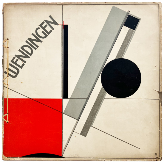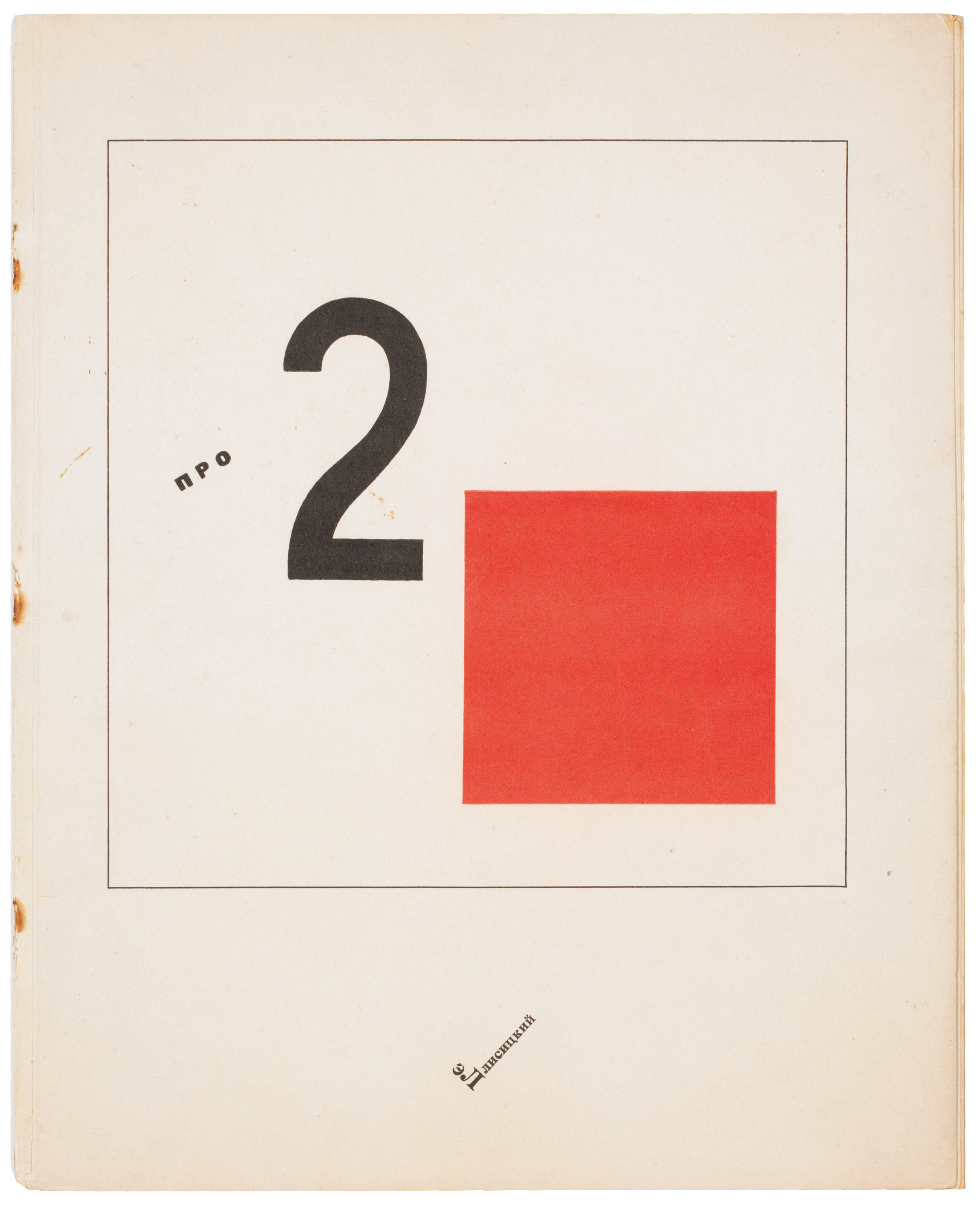
Pro Dva Kvadrata. Suprematicheskii Skaz v 6-ti Postroikakh. (Of Two Squares: A Suprematist Tale in Six Constructions)
Lissitzky, El
Berlin. Skify / Skythen / Scythians. 1922
An excellent copy, entirely unsophisticated, of El Lissitzky's rare Suprematist tale 'Pro Dva Kvadrata'.
The total edition of El Lissitzky's seminal Suprematist typographical book is unknown but it is likely to have been issued in small numbers; a de luxe edition of 50 copies in a binding designed by El Lissitzky was also issued. A second edition - albeit in a different format and with other typographic changes - was produced in Holland by Theon van Doesburg's De Stijl later in the same year.
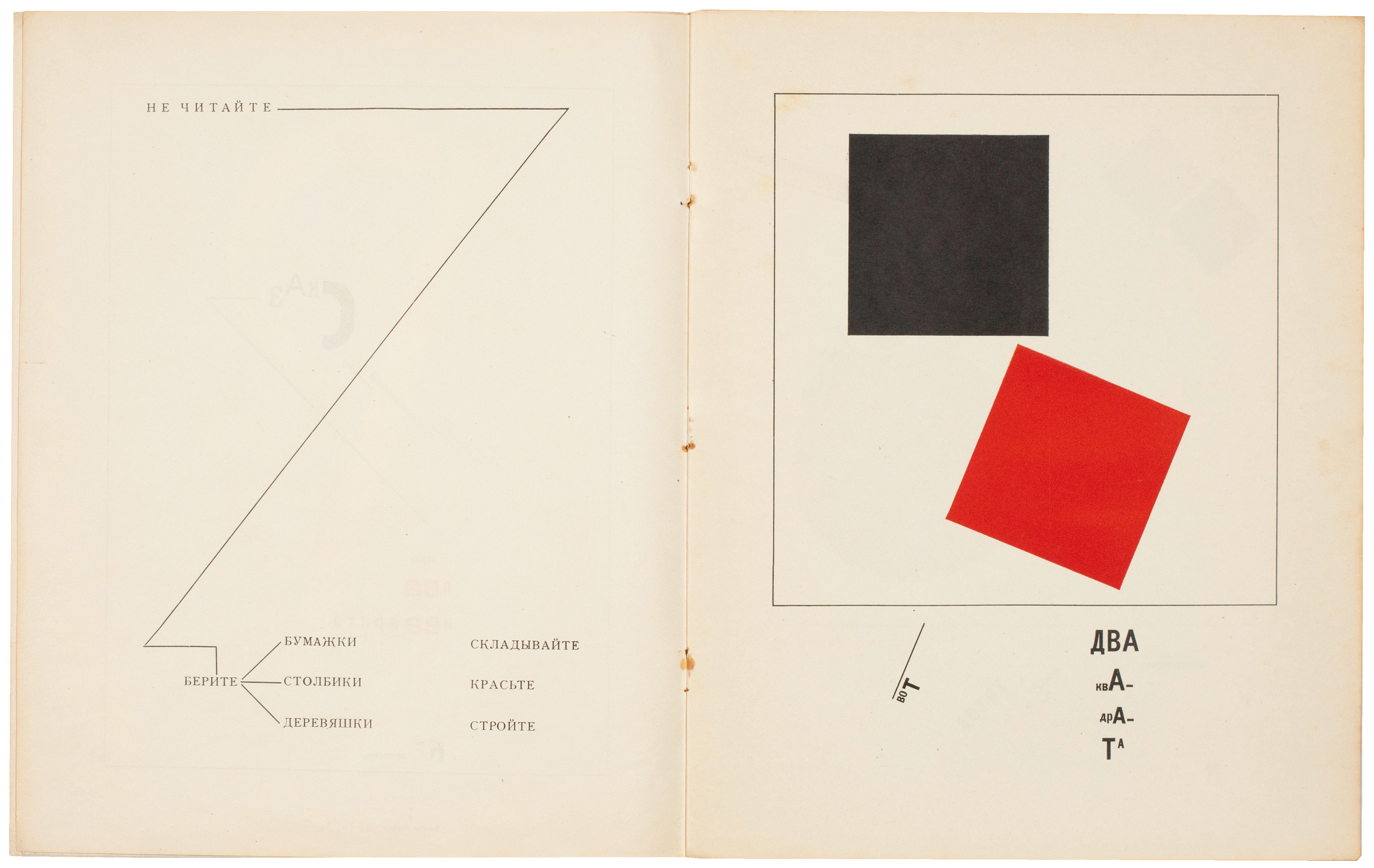
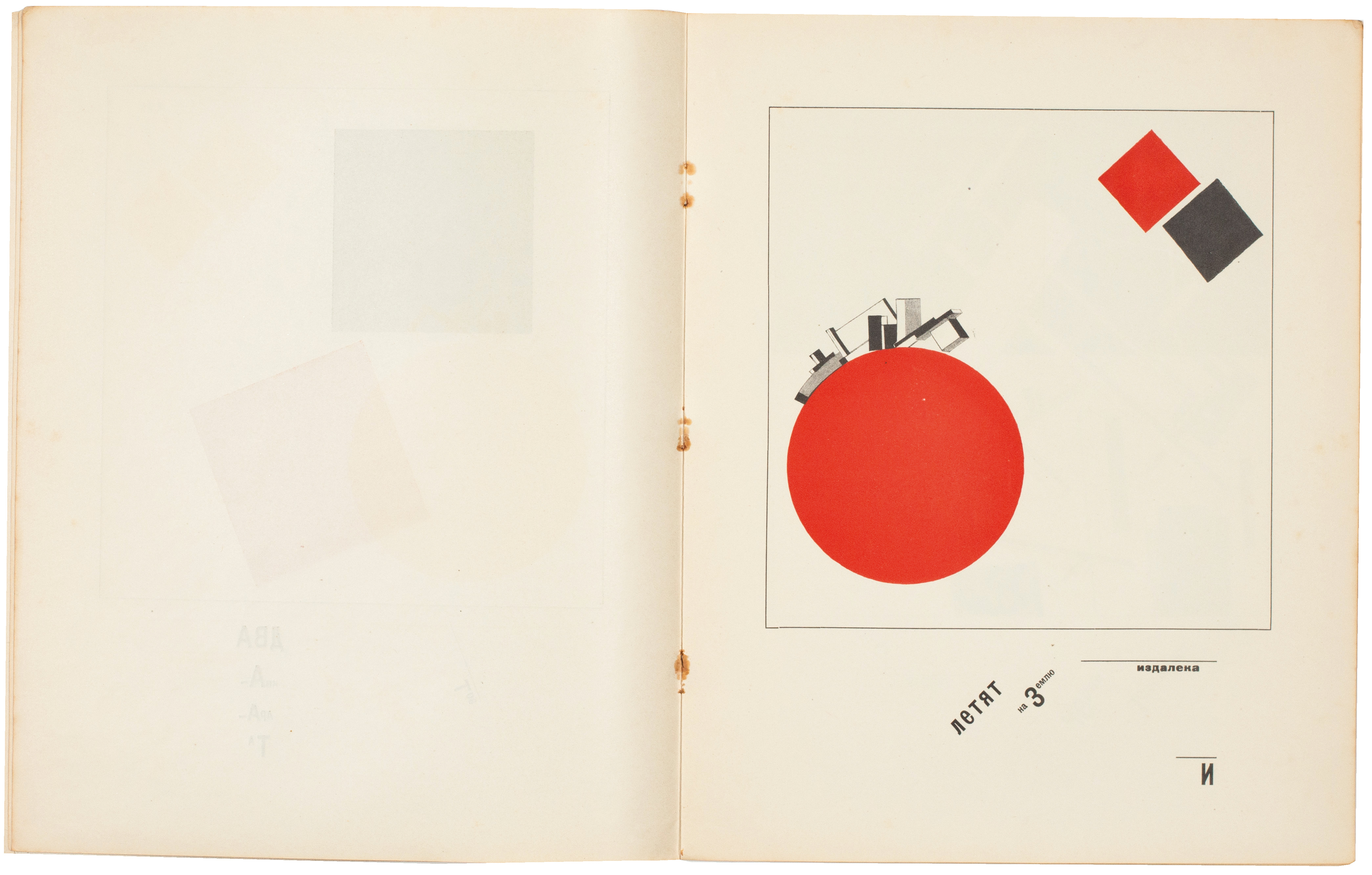
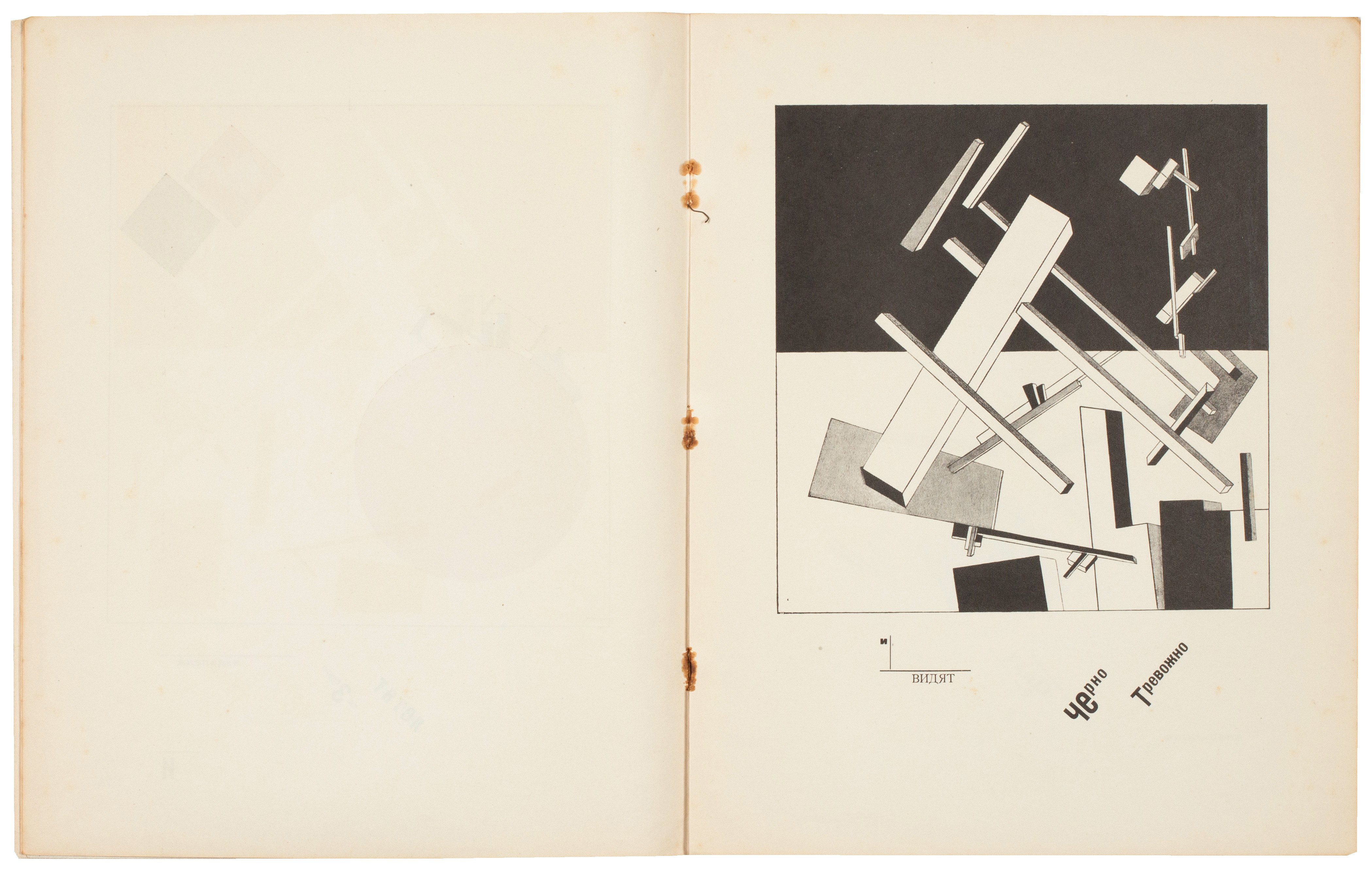
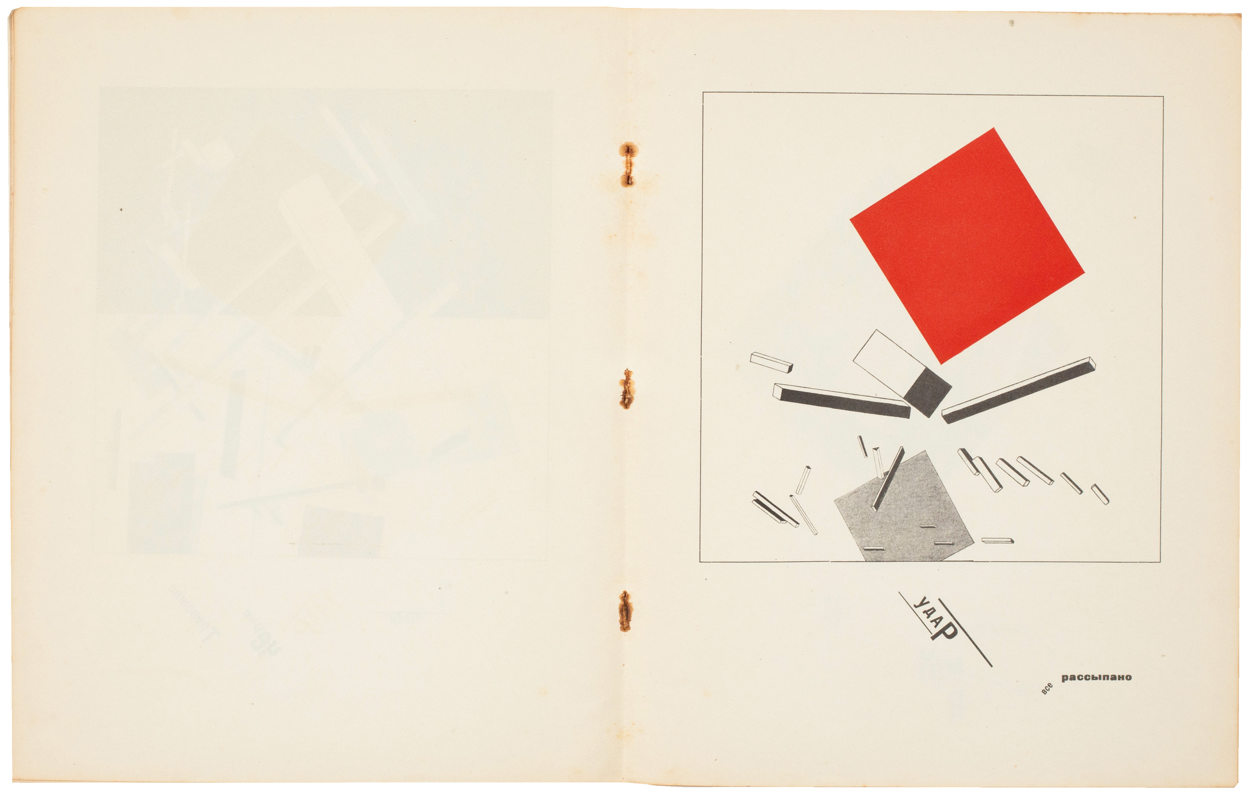
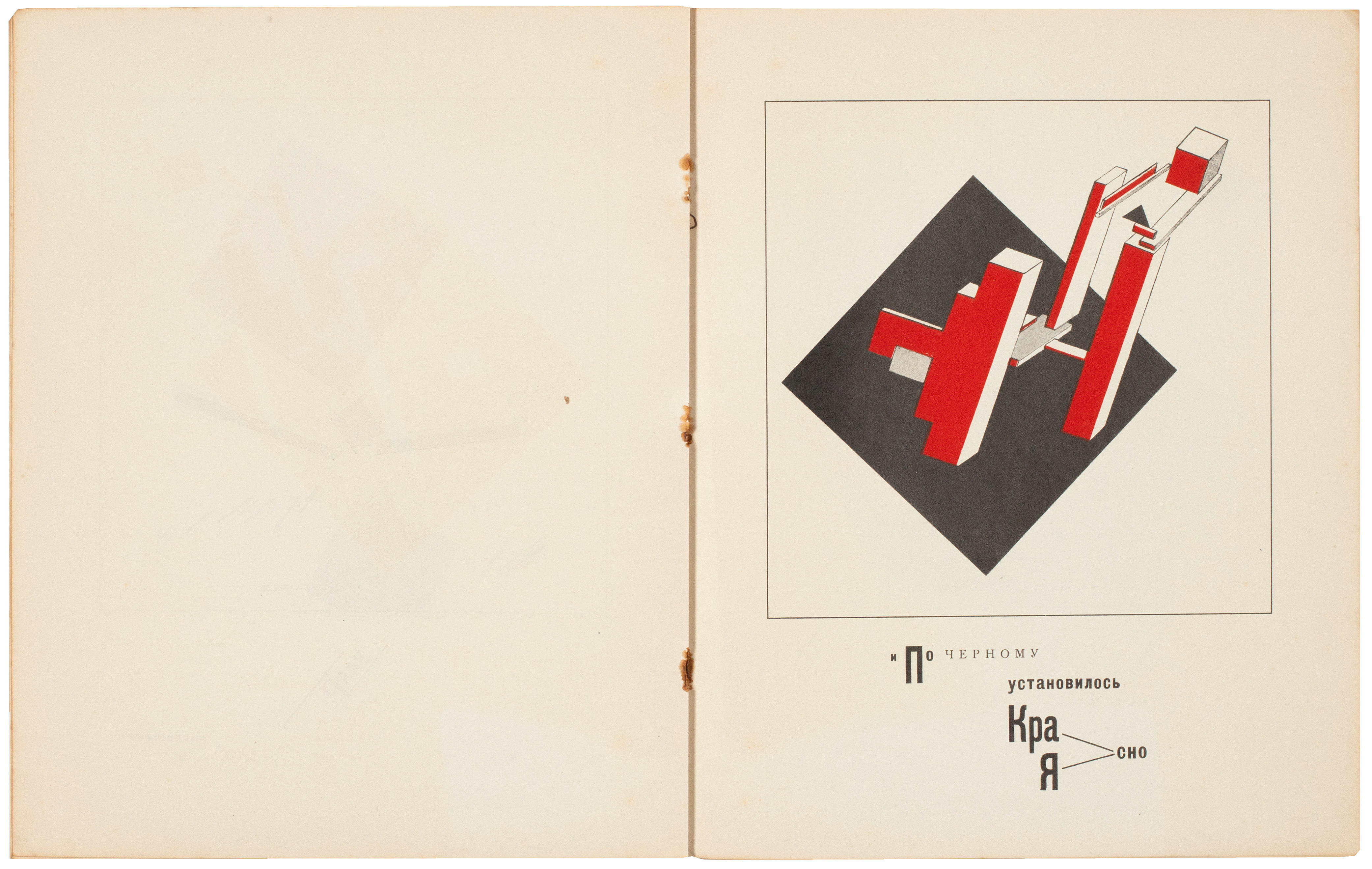
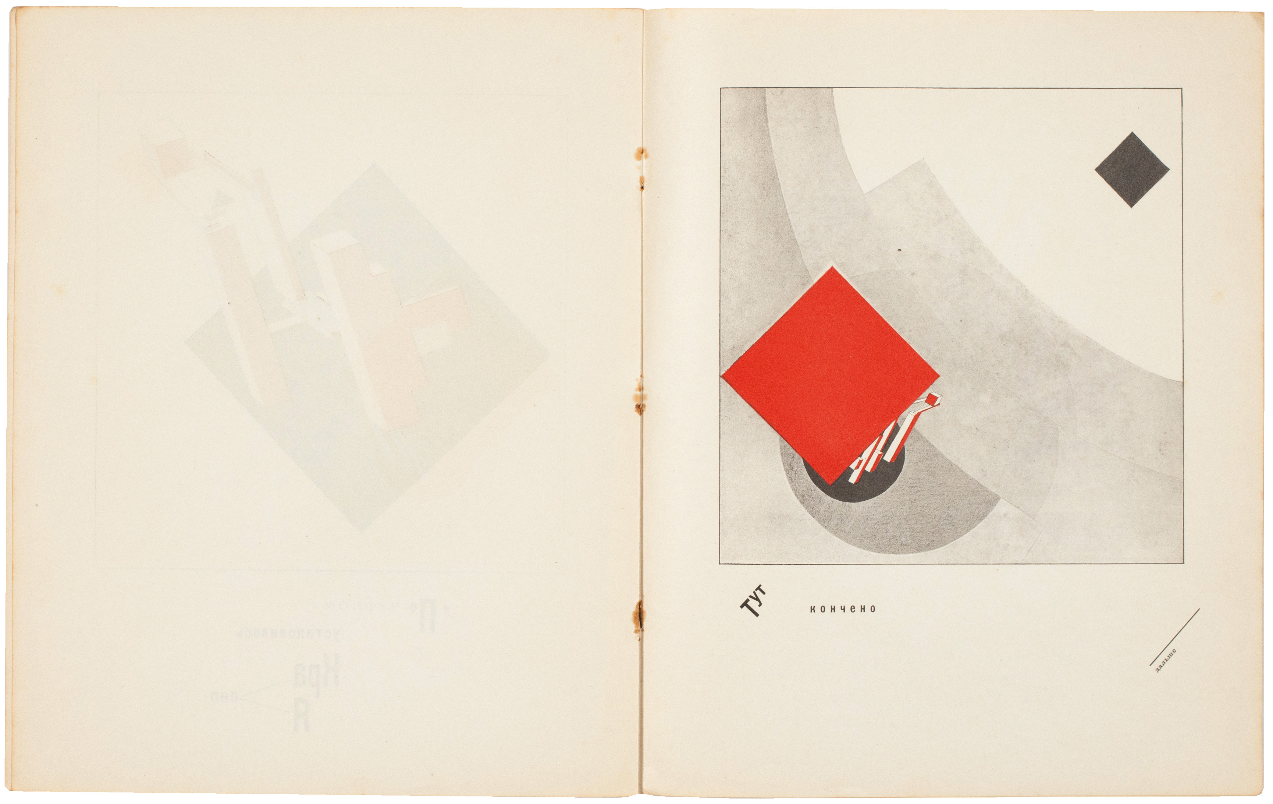
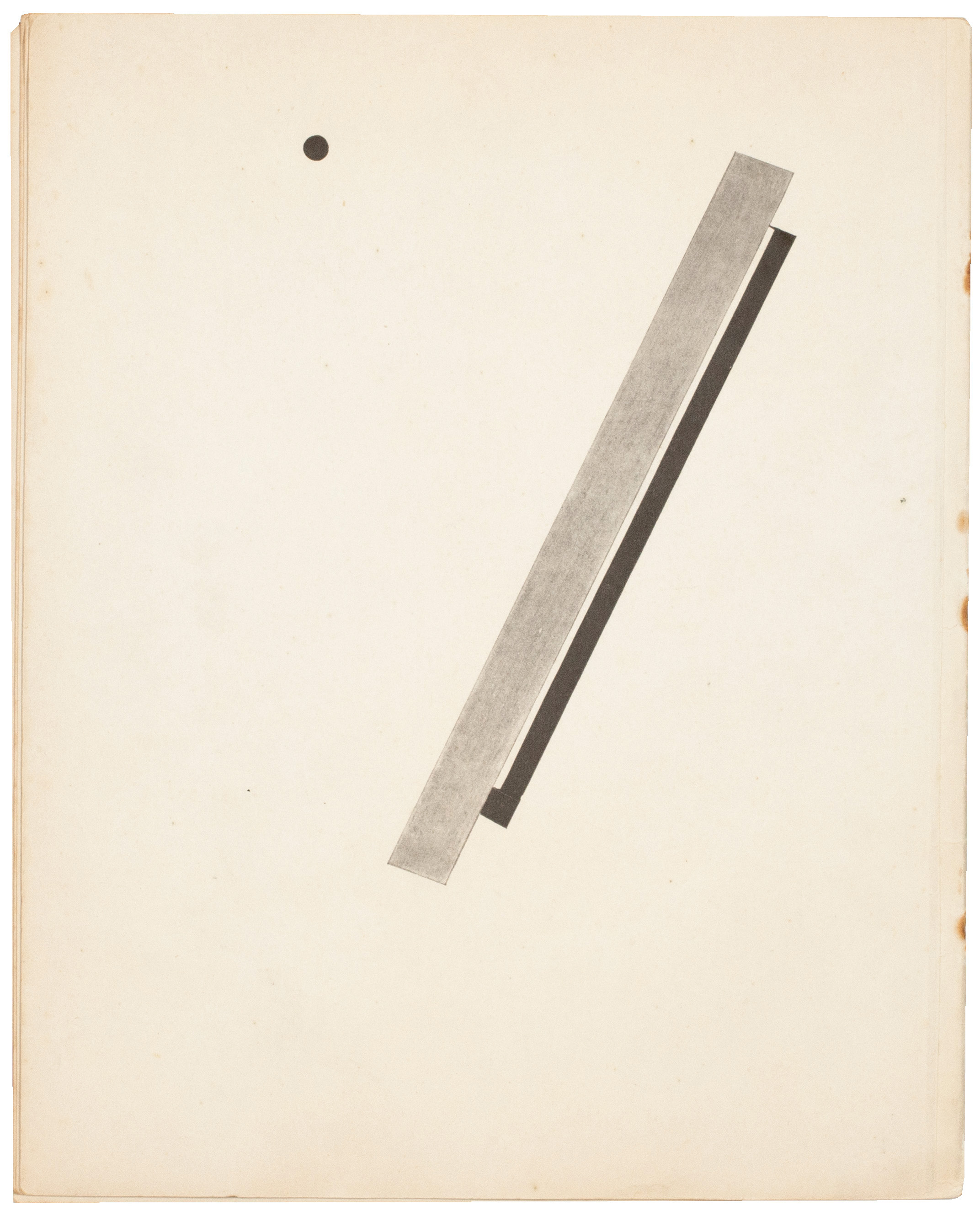
'Conceived in Vitebsk in 1920 and published two years later in Berlin, this story is dedicated 'to all, all children' and - in a witty and graphic presentation - represents the imposition of order and clarity (represented by the red square) on chaos (the black square). The reference to the Russian Revolution and the triumph of Bolshevism is obvious.' (Ex Libris 6).
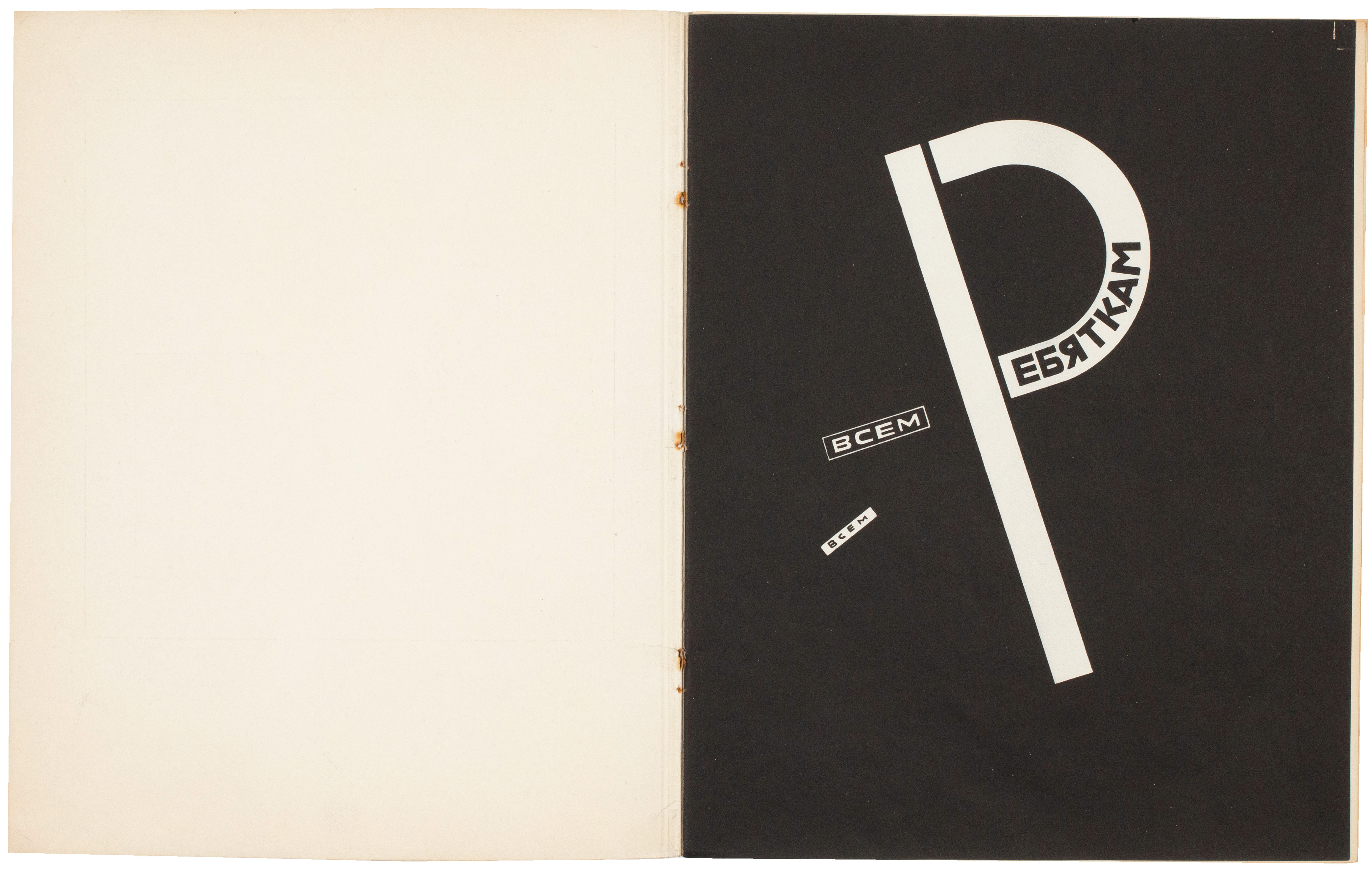
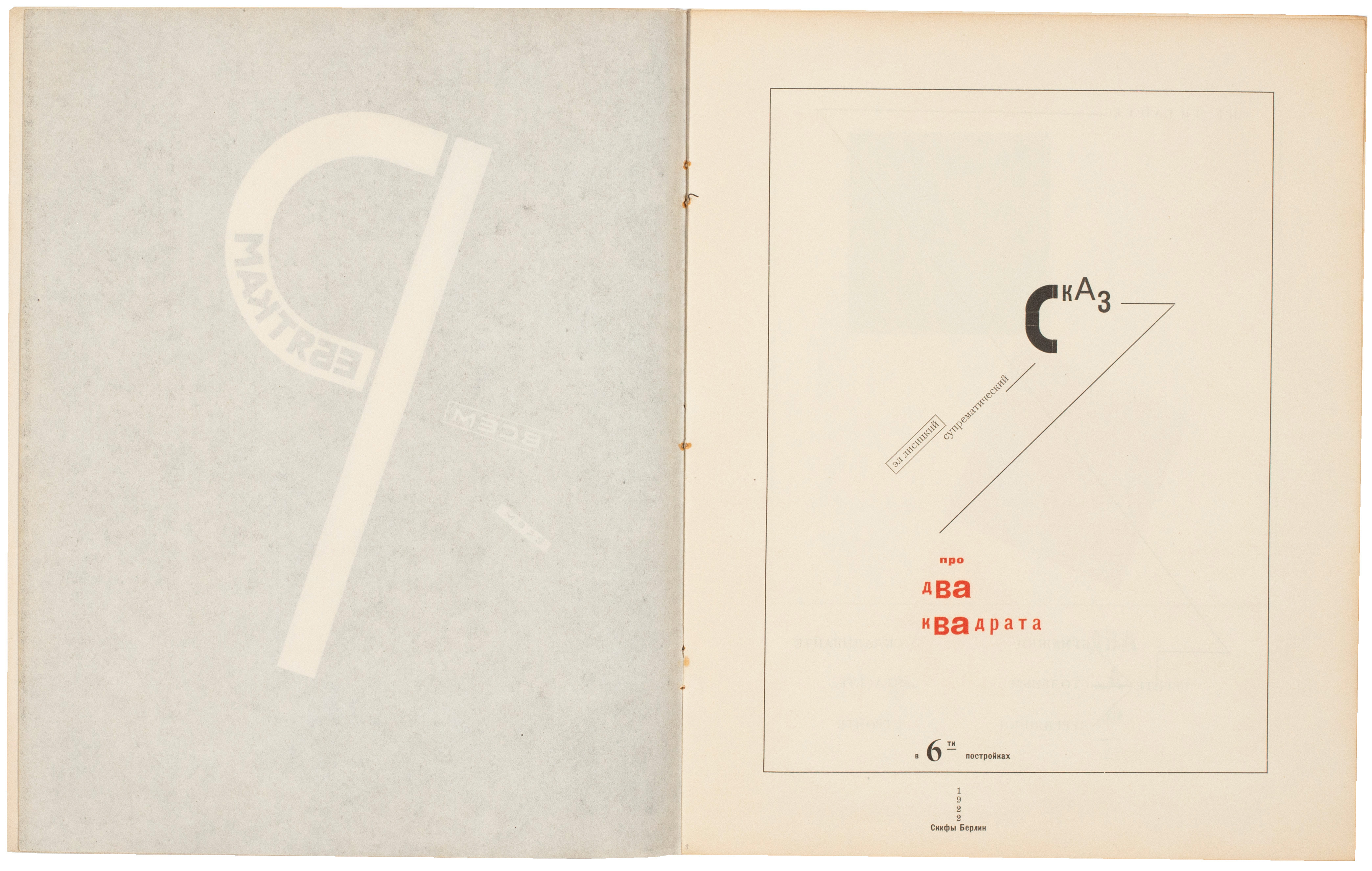
'Using typographical arrangements rather like those pioneered in Kamensky's ferro-concrete poems, Lissitzky linked one page to the next; yet the words are hardly important, each page is dominated by suprematist forms initiated by Malevich, arranged within a finely outlined square.' (Susan Compton).
'Lissitzky's pioneering advances in book design are the typographical extension of his theories of spatial dynamics. He proposed a kind of 'architecture of the book', in which the structure of a book would be determined by its purpose and content. The first fully developed project is the children's book 'Pro Dva Kvadrata (Story of Two Squares)', published 1922; typography is as much a complex of geometric forms as a sequence of linguistic signs.' (The Avant-Garde in Russia, 1910 - 1930: New Perspectives, pg. 186).
This copy of 'Pro Dva Kvadrata' is completely unsophisticated: the original staples have oxidised (only one of the three remains extant) and there is some slight staining to the spine and central spread around the staple areas as a result but the copy represents a remarkable survival and remains in excellent, original condition.
[Rowell & Wye 405; Ex Libris 6, 156; see 'The World Backwards. Russian Futurist Books 1912 - 16' by Susan P. Compton, London, 1978].
The total edition of El Lissitzky's seminal Suprematist typographical book is unknown but it is likely to have been issued in small numbers; a de luxe edition of 50 copies in a binding designed by El Lissitzky was also issued. A second edition - albeit in a different format and with other typographic changes - was produced in Holland by Theon van Doesburg's De Stijl later in the same year.
'Conceived in Vitebsk in 1920 and published two years later in Berlin, this story is dedicated 'to all, all children' and - in a witty and graphic presentation - represents the imposition of order and clarity (represented by the red square) on chaos (the black square). The reference to the Russian Revolution and the triumph of Bolshevism is obvious.' (Ex Libris 6).
'Using typographical arrangements rather like those pioneered in Kamensky's ferro-concrete poems, Lissitzky linked one page to the next; yet the words are hardly important, each page is dominated by suprematist forms initiated by Malevich, arranged within a finely outlined square.' (Susan Compton).
'Lissitzky's pioneering advances in book design are the typographical extension of his theories of spatial dynamics. He proposed a kind of 'architecture of the book', in which the structure of a book would be determined by its purpose and content. The first fully developed project is the children's book 'Pro Dva Kvadrata (Story of Two Squares)', published 1922; typography is as much a complex of geometric forms as a sequence of linguistic signs.' (The Avant-Garde in Russia, 1910 - 1930: New Perspectives, pg. 186).
This copy of 'Pro Dva Kvadrata' is completely unsophisticated: the original staples have oxidised (only one of the three remains extant) and there is some slight staining to the spine and central spread around the staple areas as a result but the copy represents a remarkable survival and remains in excellent, original condition.
[Rowell & Wye 405; Ex Libris 6, 156; see 'The World Backwards. Russian Futurist Books 1912 - 16' by Susan P. Compton, London, 1978].
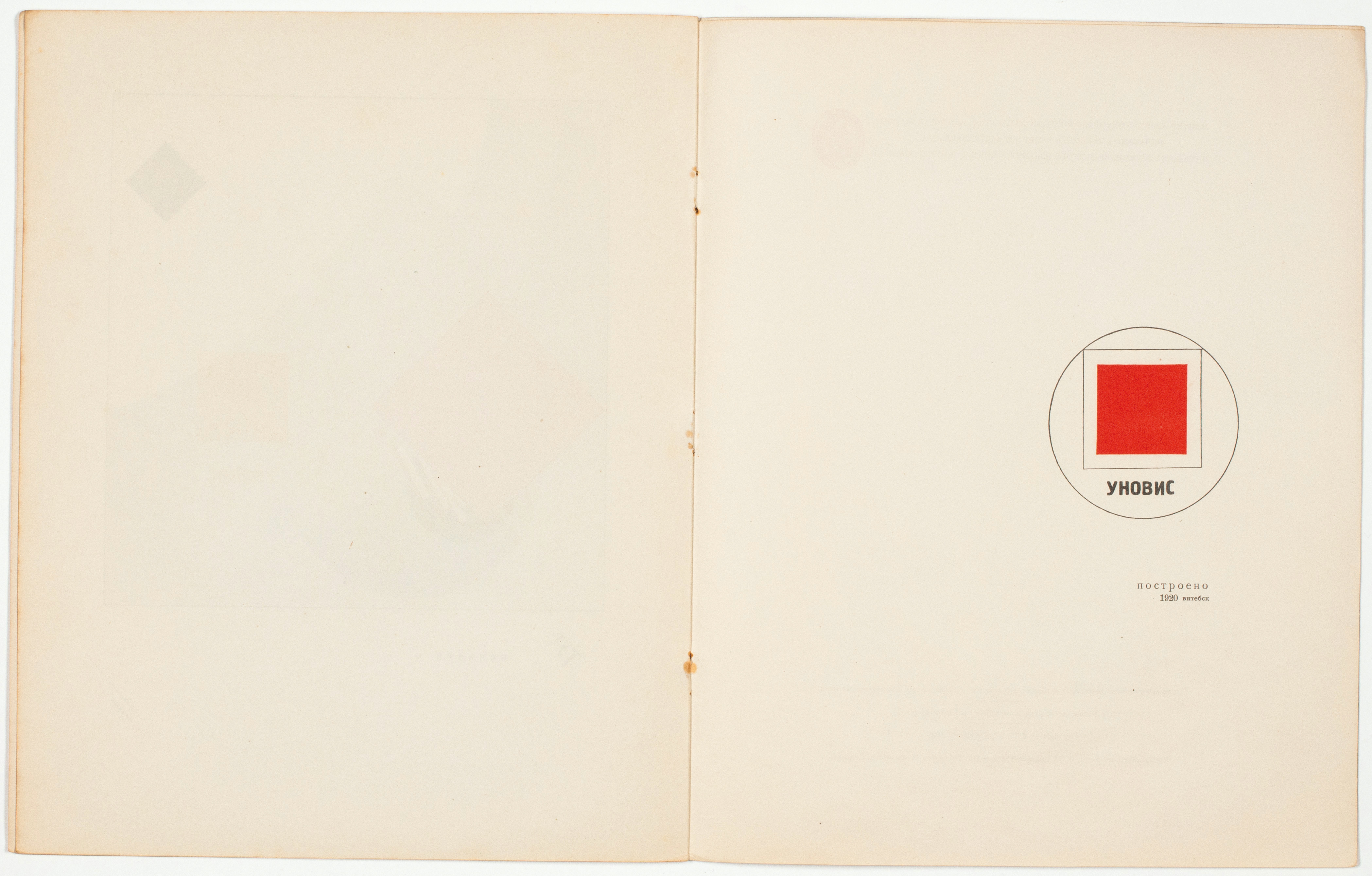
[10 unnumbered leaves]. 4to. (280 x 225 mm). Contents: leaf printed in black with dedication recto only, printed title in red and black with typographical letterpress text verso, 6 leaves with 'Of Two Squares' printed in red and black recto only, leaf with colophon in red and black and publisher's imprint verso, final leaf printed in black verso only. Twelve Suprematist typographic constructions by El Lissitzky in red and black including those for the original wrapper. Original publisher's cream printed wrappers with typographic constructions by Lissitzky to front and rear covers.
#48741